Halebop is a Swedish mobile operator and has almost since the inception been a part of Sweden's largest telecom operator Telia.
I joined Halebop as an on-site designer, helping the team in a "jack-of-all-digital-trades" position at 50%. Initially, I joined Halebop to support in the continuous design and development for the website, specifically the home page. Due to technical limitations, a lot of the modules had to be custom made.
As time progressed, I worked more and more with other areas and teams, e.g. building prototypes, re-designing the new app, coding email newsletters and so forth.
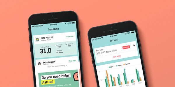
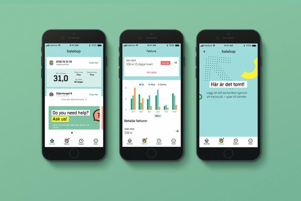
Re-designing the app
Screens from the initial re-designed Halebop app I was part of designing. For me it was important not to overuse the graphic elements, rather letting them be used with a purpose. Empty states is a great place for this.
New broadband offering
Things move quickly in the telecom sector. From the decision to offer broadband and going to market was quick. I helped out with prototyping, UX and initial UI for how to introduce the new broadband offering.
Halebop.se
The visual identity of Halebop is full of fun elements. They can easily be used too much and I helped design with the purpose to make them fun and surprising.
Various projects
Something the Halebop brand really lacked and something I think almost every digital brand needs is a loading symbol. For the new app I designed one to be used on both buttons and inbetween loading screens.To help the team in creating duo-tone images – an important part of the Halebop-brand – I built a standalone javascript plugin be used in the digital guidelines tool. Example photo by Daniel Adesina.