Notes Opinions on the NA-KD logo
- Published
- August 19, 2018
- Written by
- Andreas Nymark
- Labeled with
- design,opinion,logotype,optical
As with every other nerd, the tendency and urge to “correct” things you consider is strong. Well, I decided to do a little 30 minute exercise. At the same time educate and spread my views and opinions.
The logotype for fashion company NA-KD is one that’s been nagging me a bit too much. With a max of 30 minutes, I decided to improve on the things I consider the most obvious. Only focusing on the logotype.

My improvements
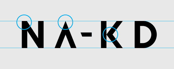
Since this is a short exercise, I’m only highlighting the most obvious mistakes. The logo is not consistent, varies in optical weight and lacks optical compensation.

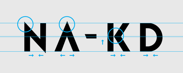
With not being consistent, I mean that the top of the A should be in line with how the top/bottom of the N looks like. Since the A is more unique, I decided to incorporate that in the N.
I’m also not a fan of the horizontal line created on the K, between the stem and diagonal strokes. The touching-not-touching part. With a bit of distance, it looks a little better.
To make it more balanced I’ve also made N, K, and D more narrow. And the A is slightly wider.

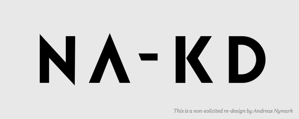
The end result is a more coherent, balanced logotype. Each character looks related to each other. The whitespace between and within each character is also better balanced, but not perfect.

I hope this gave you some useful information, and some practice on how to look at the details.
Bare in mind. This is an non-solicited re-design. It’s easy to look at things from the outside, like I’ve done. I haven’t been in the room, taking part in any discussions. Sometimes, the client is very decisive. Other times, the end result as intended. I hope I haven’t offended any designer, my intentions is not to make anyone feel bad. If so, please let me know.