Notes Slab No. 1
- Published
- March 21, 2015
- Written by
- Andreas Nymark
- Labeled with
- font,typography,slab no.1
Two years ago I launched an ambition to expand upon the open source font Chunk with a larger set of characters.
Back then, for a client, I added more latin glyphs and began working with diacritics. Unfortunately — as with a lot of other things — it all ran out in the sand and I didn’t find the time to fully complete it.
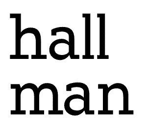
As a way to be more proficient in typography, I’ll continue to expand Chunk with a regular weight. The long term plan is to add more weights, still keeping it open source.
My goal with Slab No. 1 is to consist of a normal, an italic, a bold and a bold italic weight alongside the now existing ultra-bold weight.
Designing characters
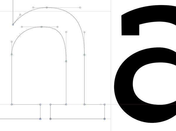
So far, it's very early and I'm testing a few different alternative routes. Ultimately, it may affect the details of the original, hopefully for the better but probably just based on personal taste.
Right now the lowercase “a” is going an alternative route compared to the original. The lower case “a” has a terminal ending compared to the original. If this will be the final design, this will be reflected in Slab No. 1 Black. But it’s a little too early to tell.
Open source on Github
Right now, of course, Slab No. 1 isn’t particularly useful as of now but please follow its progress on Github.
Chunk
The font Chunk is designed by Meredith Mandel and is open source.
Renamed
Slab No. 1 was from the beginning named Chunked, but to avoid confusion with the original Chunk I’m renaming it.