Notes Carl & Fernando
- Published
- May 1, 2015
- Written by
- Andreas Nymark
- Labeled with
- design,challenge,carl fernando
Me and my good friend Giovanni Vivanco are both designers eager to create. As a way to feed ourselves with new challenges, we started a bi-weekly show and tell.
The idea is to interrupt scheduled weekly work with minor challenges. It’s also to show there’s not one way to create a design. Two designers will approach a brief in their respective modus operandi. It’s all about the designer. There’s always another solution. Each challenge shouldn’t be more than a couple of hours work.
The name for the challenge is basically a combination of our additional given names, Carl and Fernando. And maybe a name for future agency to reckon with?

First challenge
We started of with a minor logo challenge. We are planning to put up our work on display online, so creating a website will be for a future task. And to brand this platform we decided to create a logo as the first challenge. Pick a typeface and a weight, solely based on personal flavour. We then combine each typeface to create a logo for the platform where we’ll share our process and work.
Second challenge
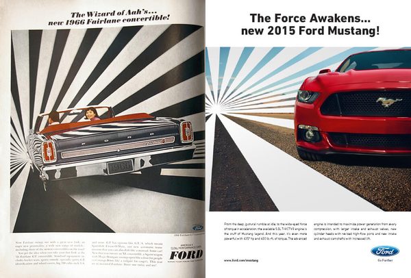
Time machine. Go back in time, to the golden days of advertising and redo an ad using a modern product, suitable to put in a magazine.
I chose to redo an ad for the 1966 Ford Fairlane. The ad seems to be referring to The Wizard of Oz so I basically wanted to refer to a more relevant movie, the upcoming “Star Wars: Episode VII” and used the tagline “The Force Awakens.” Suitable for a car.
Third challenge
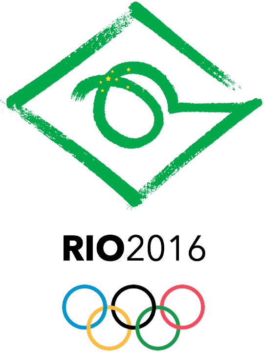
Without the pen leaving the paper, draw a symbol for the olympic games 2016 in Rio de Janeiro.
Never been to Rio de Janeiro, or Brazil for that matter, I started doing some basic research for visual concepts. I ended up with a symbol combining elements from the flag and a very abstract interpretation of “Christ the Redeemer”.
As the olympics is probably the competition of the year for many athletes, they’re perfecting their performance up until the day of the competition. I wanted to find this perfection within the lines. Trying to achieve perfect lines with a way to convey speed.